Content, content, content... and constructive feedback
I'm going to try to knock one of these out each week that I'm working on the game.
This week has been all about knuckling down and getting more content in the game. I started out by grabbing a few asset packs that were all about dungeons, and setting up on the Unity content pipeline as tile decorations and/or solid tiles. I can now decorate the dungeons with cobwebs, torches, keg piles, hanging skeletons and so on, to help break up the rooms and corridors.
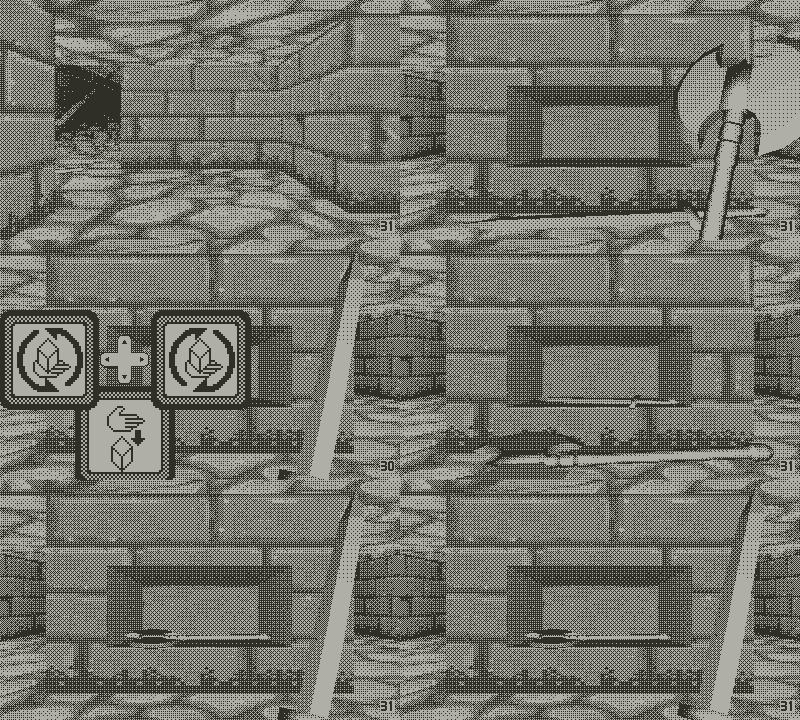
Next up, I added alcoves where you can find items - just like in those old games. While doing that, I also added tables as another piece of furniture you can find and place items on.

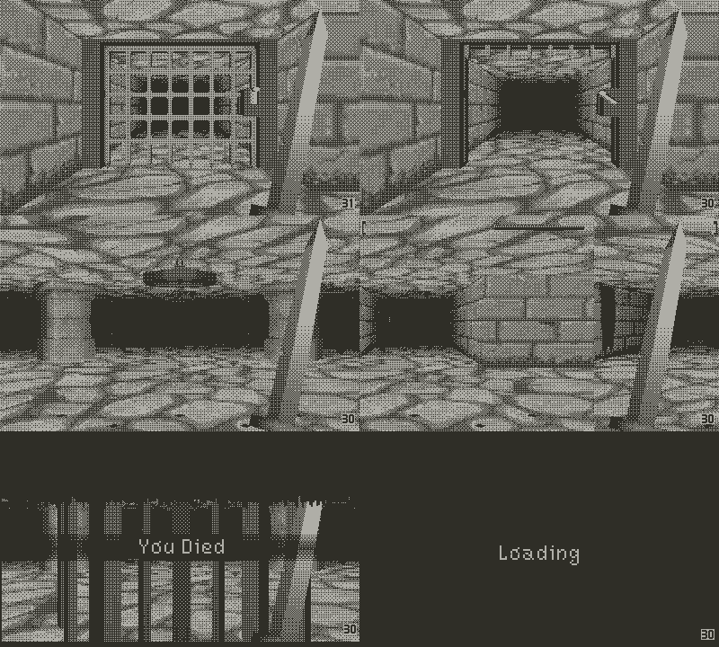
Next up was traps, because every good dungeon needs those. I'm working on exactly how visible the traps should be (difficult without an actual device), but that's something easily tweakable.

I also added a few food items that will be used heal, and then added some new doors. One-way doors (need to be opened from the other side) will allow for fluid level design with minimal backtracking. I reworked the basic door to have a handle that looks way more like a crank, and added a door that is missing a crank that can be found elsewhere (a Playdate-themed alternative to keys!).
I also added doors that are activated by switches located elsewhere, and added in pressure plates that trigger a door when the player steps on them. Of course, the door closes again when the player steps off, so they'll need to leave something behind to keep the door open!

When I posted that last gif in the Playdate developer discord channel, it kicked off some scary but well-intentioned constructive criticism of the game's art so far. After sitting with what was said I've essentially boiled it down to:
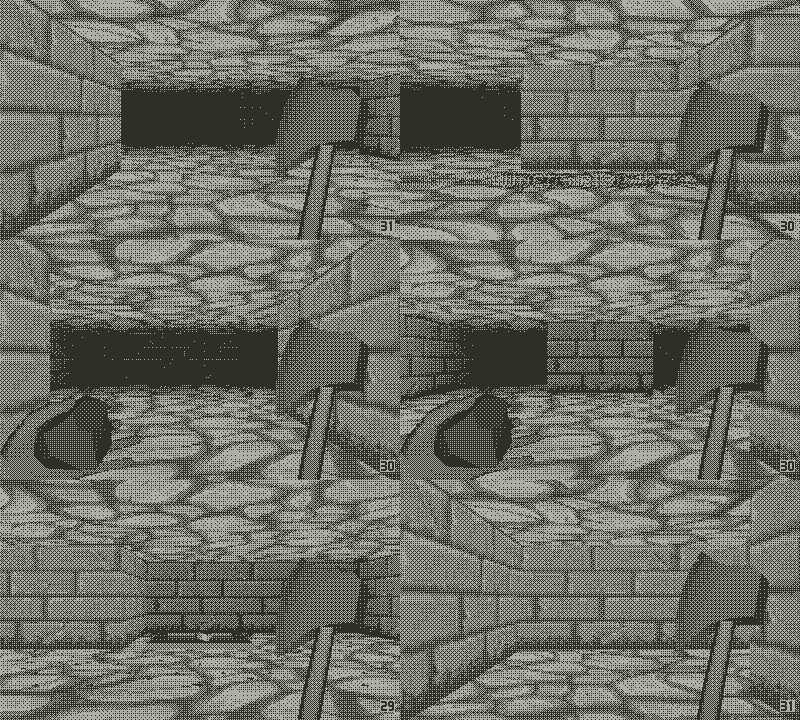
- The game has a lot of midtones, which means that interactive objects (weapons, items in hand/on the floor) tend to blend in with the environment where they don't have a clear outline.
- The dithering is too uniform
- The wall textures don't allow for the clear delineation on convex and concave corners
I'm trying to keep to a fairly "realistic" or textured aesthetic as I really like it and I think it's working so far. Changing this up to lean more toward bolder lights and darks will essentially mean using a pixelart/hand drawn style which with my art skills will likely look terrible. So I think at this stage I'm not going to change the environment art, aside from reworking the dithering.
However, I have been struggling to make the wielded weapons, and items in the environment stand out. I've got a limited toolset to work with, essentially using the same shader for all objects which includes a fresnel outline which works really well for rounded geometry (e.g. the axe handle) but not well at all for flat surface (the axe head).
So I definitely need to work a proper outline process into the pipeline somewhere. This will likely need to happen during the production of the individual sprites, before they're packed into a sheet. And it'll need to take into account whether the object already has a bold light or dark edge (so don't add one).
The dithering is also something I can rework. It was suggested that I look into using Atkinson dithering rather than the bayer 4x4 that Unity's shadergraph dither node is using. That will mean moving the grayscale to 1-bit dithering out of the shader and applying it either to each individual sprite or the whole sheet as it is produced.
Lastly, the wall/corner texturing issue is completely obvious now that it's been pointed out, and a really simple fix. The texture's bricks are staggered in quite a weird way that means you only get one hard edge of mortar. Lining the texture up a bit better should fix that, and I'll add a little more of a border on the top edge, too.
So yeah, a really productive week while learning some hard truths about an art style that I was overall happy with the direction of, despite some of the details being difficult.
Get Legend of Etad (for Playdate)
Legend of Etad (for Playdate)
First-person dungeon crawler for the Playdate
| Status | Released |
| Author | Gareth Williams |
| Genre | Adventure, Puzzle |
| Tags | 1-bit, Dungeon Crawler, Exploration, First-Person, Playdate |
| Languages | English |
More posts
- Chapter 3 ReleaseMay 08, 2023
- Legend of Etad: Chapter 3 and Catalog, 9th MayApr 28, 2023
- Legend of Etad Chapter Two - Update out now!Dec 16, 2022
- Legend of Etad Chapter Two Release DateDec 08, 2022
- Chapter Two Progress and Sales DataNov 23, 2022
- An Amazing First Week + 1.1 HotfixSep 30, 2022
- Legend of Etad Chapter One - Available now!Sep 23, 2022
- Content Complete and Release DateSep 12, 2022
- Hitting the LimitsAug 08, 2022
- Playdate Get!Jul 25, 2022

Leave a comment
Log in with itch.io to leave a comment.